Problem: Turning Sketches into Code Takes Too Long
You've got a wireframe on a napkin — or a Figma mockup — and translating it into clean React components takes hours. Generative UI tools like Vercel V0 collapse that gap to minutes.
You'll learn:
- How to prompt V0 effectively from a sketch or description
- How to iterate on generated components without starting over
- How to export V0 output into your existing Next.js or React project
Time: 20 min | Level: Intermediate
Why This Works
V0 is a generative UI tool from Vercel that takes text prompts or image uploads and outputs React + Tailwind (or shadcn/ui) components. Unlike generic AI code generation, V0 is tuned specifically for frontend interfaces — it understands layout, spacing, and component hierarchy.
The key insight: V0 isn't a one-shot generator. It's a chat-based interface where you describe, refine, and iterate. Treating it like Figma with a prompt bar gets the best results.
Common stumbling blocks:
- Vague prompts produce generic-looking output
- Ignoring V0's iteration features and starting fresh every time
- Copying raw V0 output without adapting it to your design system
Solution
Step 1: Prepare Your Sketch or Description
V0 accepts two inputs — a text prompt or an image upload. Both work, but combining them gets the best results.
If you have a hand-drawn sketch or Figma frame, export it as a PNG. If you only have a concept, write a structured prompt.
Structured prompt format:
[Component type] for [use case].
Layout: [describe the layout — grid, sidebar, stacked]
Elements: [list the UI elements — nav, cards, table, form]
Style: [minimal / material / shadcn / custom]
State: [what interactions matter — hover, modal, toggle]
Example:
Dashboard page for a SaaS analytics app.
Layout: sidebar nav on the left, main content area on the right
Elements: top stats row with 4 KPI cards, a line chart below, a recent activity table
Style: shadcn/ui, clean and minimal
State: sidebar items should show active state on hover
The more concrete you are about layout and elements, the less iteration you'll need.
Step 2: Generate and Iterate in V0
Go to v0.dev and start a new chat. Paste your prompt or upload your sketch image.
V0 generates a preview and the full component code. Resist the urge to copy it immediately.
Iteration commands that actually work:
"Make the sidebar collapsible"
"Replace the line chart with a bar chart"
"Add a dark mode toggle to the top nav"
"Use a 3-column card grid instead of 4"
"The table needs pagination controls at the bottom"
Each message refines the existing component rather than regenerating from scratch. V0 preserves your prior choices while applying the new instruction.
 V0 generates a full preview alongside the component code — iterate directly in chat
Step 3: Export to Your Project
Once you're happy with the result, V0 gives you three export options:
Option A — Copy the code directly:
Click "Code" in the V0 panel and copy. The output is self-contained React + Tailwind. Paste it into your component file.
# Make sure your project has the required deps
npm install tailwindcss @radix-ui/react-icons lucide-react
npx shadcn-ui@latest init  # if using shadcn components
Option B — Install via CLI (fastest):
# V0 gives you a one-liner in the UI
npx v0@latest add [your-component-id]
This pulls the component directly into your /components directory and installs any missing shadcn dependencies automatically.
Option C — Open in StackBlitz:
V0 has a "Open in StackBlitz" button for immediate full-project previewing. Useful when you want to test the component in context before copying it locally.
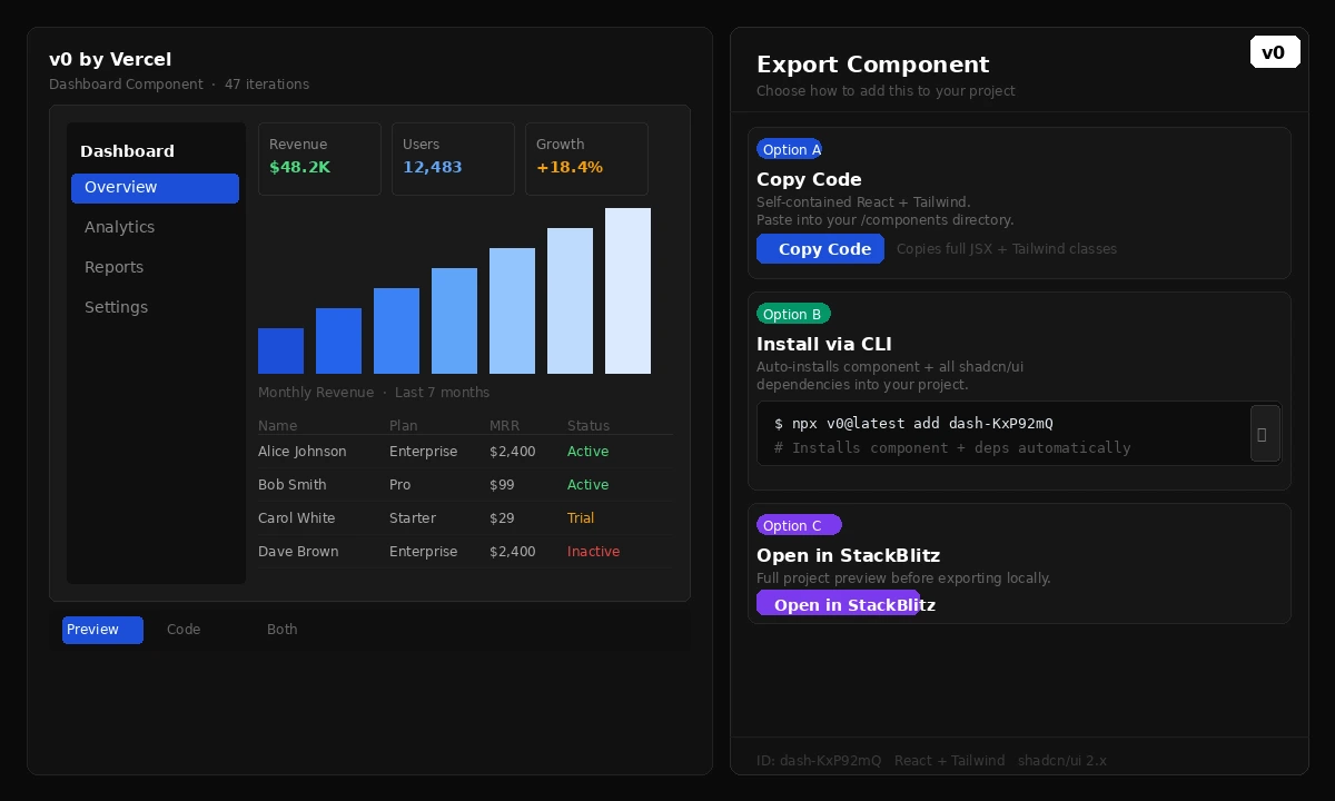 Three export paths — copy code, CLI install, or StackBlitz preview
Step 4: Adapt to Your Design System
Raw V0 output uses generic Tailwind classes and shadcn defaults. A few targeted edits integrate it into your existing project.
// V0 output — generic colors
<div className="bg-blue-600 text-white px-4 py-2 rounded-md">
  Dashboard
</div>

// Adapted to your design system tokens
<div className="bg-brand-primary text-white px-4 py-2 rounded-md">
  Dashboard
</div>
If you're using CSS variables or a custom Tailwind theme, do a quick find-replace on the color classes. V0 components are intentionally flat — no deeply nested custom logic — so adaptation is straightforward.
If something looks off:
- Fonts don't match: Add your font family to the component's root className
- Spacing is off: V0 defaults to 4px grid; adjust
gap-*andp-*values - shadcn components missing: Run
npx shadcn-ui@latest add [component-name]
Verification
Run your dev server and confirm the component renders correctly:
npm run dev
You should see: The generated UI renders without hydration errors, Tailwind styles apply correctly, and interactive states (hover, focus) work as expected.
Check the browser console — V0 output is generally clean, but if you see missing module errors, a dependency wasn't installed. Run the shadcn init command again and add any flagged components.
What You Learned
- Structured prompts (layout + elements + style + state) produce significantly better V0 output than vague descriptions
- V0 is an iterative tool — chat-based refinement beats regenerating from scratch
- The CLI export (
npx v0@latest add) is the fastest path into an existing project - Adapting V0 output to your design system is mostly a color and spacing find-replace
Limitation: V0 generates static layouts well but struggles with complex state logic — authentication flows, multi-step forms, and data-fetching patterns still need manual work. Think of V0 as a UI scaffold, not a full component.
When NOT to use this: If your design system is heavily customized (non-standard tokens, proprietary component library), V0's output will require substantial rework. It's most valuable when you're using shadcn/ui or vanilla Tailwind.
Tested with V0 (February 2026), Next.js 15, shadcn/ui 2.x, Tailwind CSS 3.4